This week marks the first week of the monthly, studiojeffrey newsletter.
Day & Night Decals →
Day & Night decals are now available in the shop. They each measure 6 by 2 inches, with a high quality matte finish print. Perfect for your water bottle. At least that’s where mine is! Represent your taste in design.
Shop decals here.


Denver Shop Partner
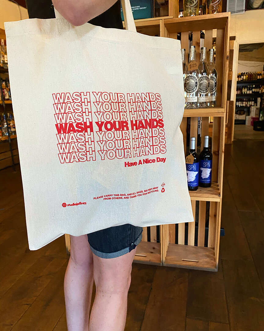
Bottles and Bitters at Sloan’s Lake is now carrying the Wash Your Hands tote bags. Thanks for the partnership and continued friendly service. Very happy to be among your shelves. Check out their prime selection, located at 5219 W. 25th Ave, Edgewater, Colorado.
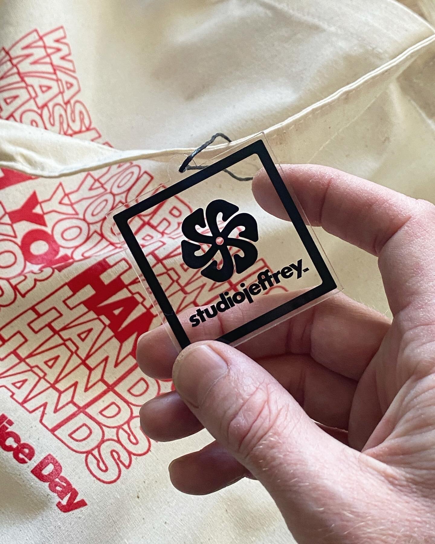
New Shop Tags →
New, clear hang tags are here for the shop. They make great keychains. Stay tuned for new products. And thank you for your support.
There are still a few totes left and I will cover shipping again this month. Apply “FREESHIP” at your checkout.
Shop Here!

Client Testimony
It’s always so great to find good feedback in the inbox. Thanks again Burke Builders in Boulder, CO. Check out some of their amazing work!

Photo: @burkebuilders

Civic Entertainment Group - A Seacrest Global Company
It’s always a pleasure to work with people at their best. And Civic Entertainment Group, in New York City, is a prime example of professional creatives at their best. When the call came to work with them to provide environmental and experiential design, I didn’t hesitate. We’ve been working on projects together for a few months now and it’s been an incredible experience. Thank you, everyone at Civic.

Photo ©CivicEntertainmentGroup
Zola - Brand Experience Design
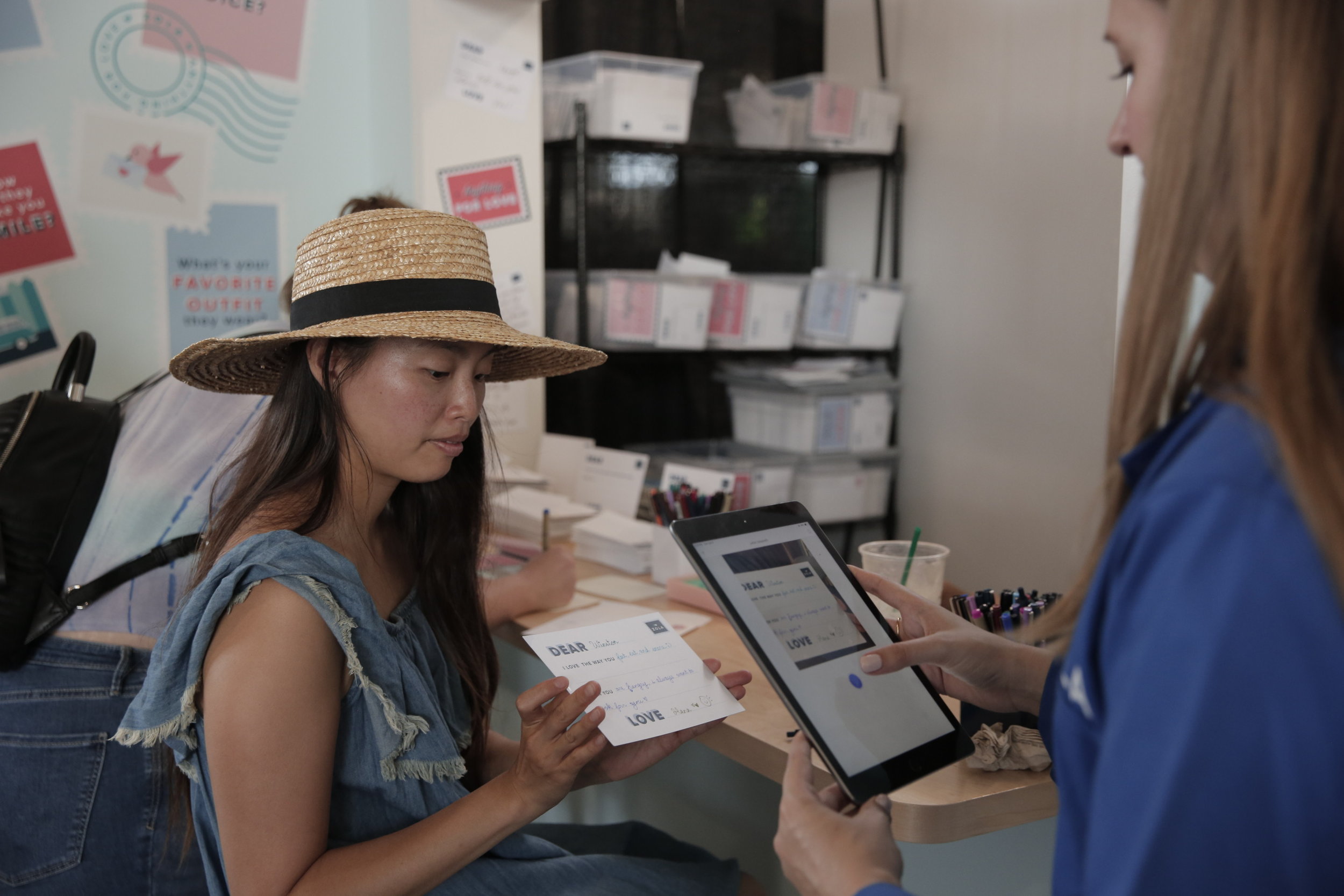
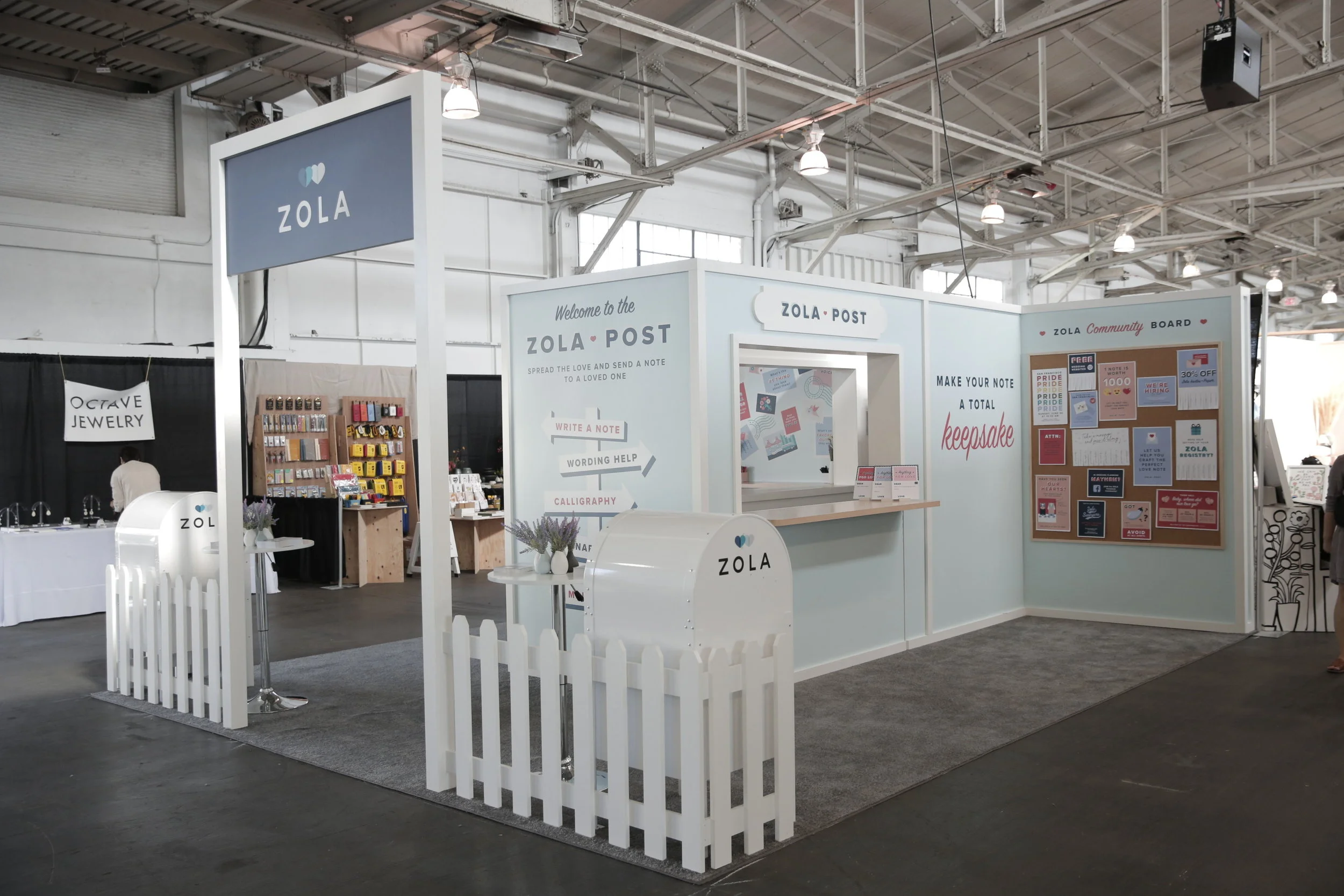
It’s a true pleasure to be hired as part of the design team, at Rebel & Rogue, to put together a “love note” experience for the industry leading wedding registry company, Zola. It all took place this past month in San Fransisco, CA.
Adhering to Zola’s brand guidelines, we were tasked with designing a place for lovers to write notes to anyone they wanted. Complete with a professional calligrapher and mail boxes to ship your love.

I loved the challenge of designing for interaction, way finding, apparel and extending the known brand elements. I especially enjoyed designing oversized stamps for a wall photo-op. We kept the solutions simple and got word that everyone was very happy with the results, both Zola and the lovers. And thanks to Rebel & Rogue for the amazing quality photos of the two day event.


Source: https://www.zola.com/
Ella Rose - Identity Design
Pleased to share the identity designs for Ella Rose. Another great collaboration with Mint Marketing in Albuquerque. This time for a hair boutique specializing in female hair cuts, colors and style.


Wild Magnolia Wellness
I was pleased to partner with Ashley at Mint Marketing in Albuquerque for the first time. I was asked to design an identity for her newest client, Wild Magnolia Wellness. A wellness clinic in New Mexico that will make counseling easy, approachable and affordable. Everyone is welcome so the design is intended to uplift and allow Wild Magnolia Wellness a future of growth, while healing on a grass roots level. Here is the selected identity design.


Mint Marketing - Visual Identity System
Working to create a brand identity for Mint Marketing in Albuquerque, New Mexico, I designed a modular identity system. Meaning that each part, the icon, type treatment, and tagline may be arranged in different combinations to distinguish the brand.
As time passes, brands may use less and less to visually communicate to their audience as it grows and learns. This strategy helps keep cost lower for the client while allowing me as the designer to produce, and think about the entire business life cycle. Plus, it allows the brand to continue visual consistency throughout, when applying the logos.
Here are six ways these branding elements are arranged to create a new visual identity for Mint Marketing.


Mint Marketing - Identity Designs
I was recently hired to design an identity for a new marketing firm in Albuquerque, New Mexico called Mint Marketing.
Immediately, we spoke about the naming and its use in the market place. We also spoke about the competition or other people using Mint in their name. This led to research that showed most designs included a mint leaf with their mint name. So, this became my starting point, to design without using a mint leaf.


The challenge became to visually communicate the strength and trustworthy nature of this agile new company in a clean and simple way. As part of Mint's marketing strategy they want a strong letter "M" in the identity and an icon that can be used on it's own. Plus, the tag line "connect, create, cultivate" to explain the mission of the company.


I used symbols of connection, light, bar charts, and line graphs to inspire the first round of designs. I always present these initial designs in black and white, as they need to work this way in branding at the most minimal visual points.
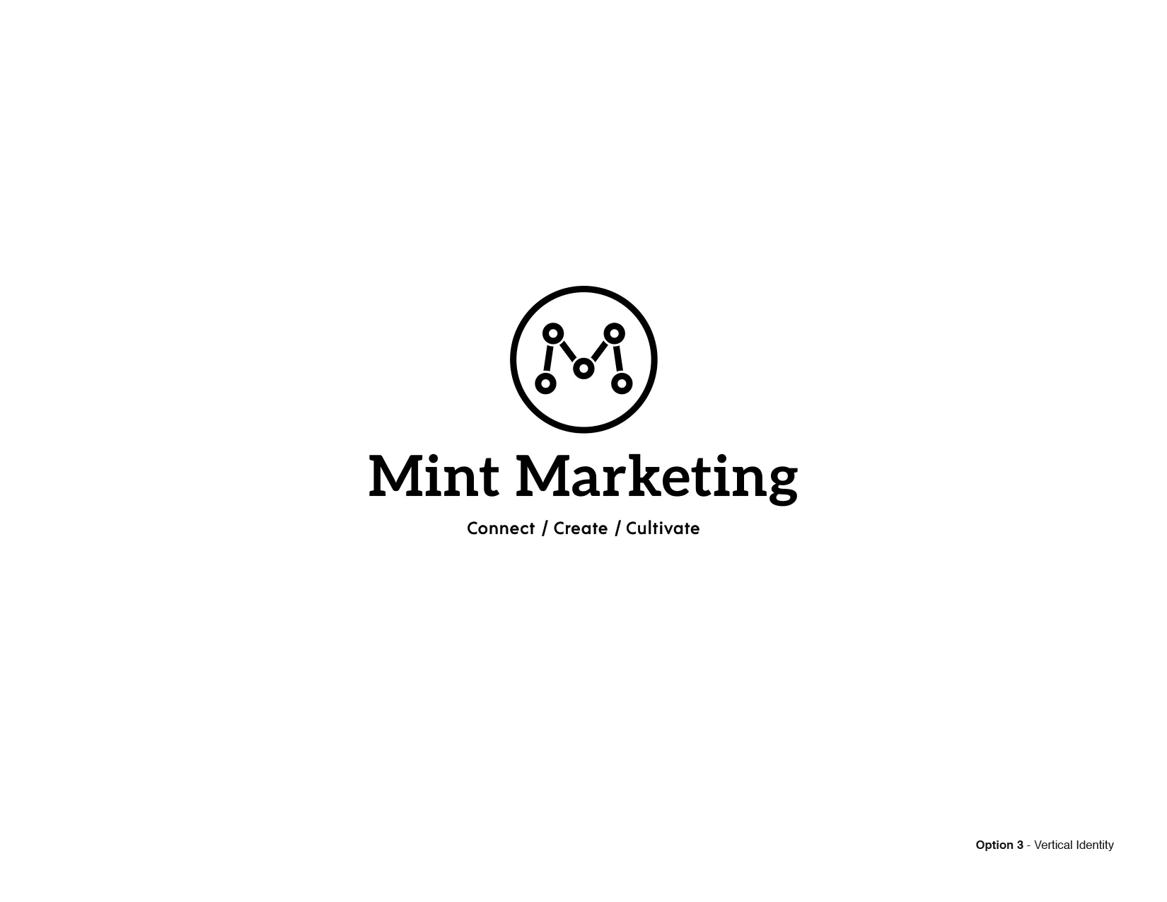


You're looking at the first round of identities that I presented this week. It includes four options, designed to be modular. Each option is a system that the client can add and subtract elements as needed.


Son of Scorpio - Shoot and Sensibility
Giving it all I've got, making a reality of this brand. This weekend was very productive as I shot, and styled the first photoshoot with Matt Merino for Son of Scorpio. Grateful to have talented, and supportive people around. Thanks again, Matt & Derek!
I am working to launch an online shop, and need to show off the products in a lookbook sort of way. To me, this brand is just as much about the connection in visuals, as the people wearing it on the street.
Here are a couple of shots and outtakes. Shop soon at sonofscorpio.com. Follow on instagram at @sonofscorpio_co


How Logos Became the Most Important Quarter-Inch in Business
"People are literally, physically interacting with those symbols in a way that they never did.”
-Michael Bierut
“Good appearance was a salable commodity.”
-Raymond Loewy
“It’s not the mark, It’s the marketing.”
-Debbie Millman
"Applying interaction-design thinking to identity design results in logos that can be 'highly logical, very stripped down'."
-David Turner
"And in what may be the most surprising development in modern identity design, we’re increasingly learning how to do it ourselves—using the tenets of branding that have been established in professional circles, to create symbols for movements."
-Debbie Millman
FULL ARTICLE

Illustration by 123 Klan for Fortune