• Portfolio
  • Latest
  • About
  • Contact
studiojeffrey
  • Portfolio
  • Latest
  • About
  • Contact

Workin' for the city

As new campaigns roll out around developing Colorado, I’ve partnered with Greenlight Strategy to design new brand identities for several campaigns. Here’s a look at the latest for the city of Westminster, Colorado.

sensible westminster in a circle, surrounding 3 arrow shapes pointing up, above a "W". With house shapes on either side of the logo.
tags: design, client, logo, lockup, graphicdesign, identity, identitydesign, colorado, icon, visual communication, branding, brand strategy, strategy, design strategy
categories: Client, Branding, Design, Graphic Design, Feature, Partner
Friday 01.28.22
Posted by jeff walters
 

Greenlight Strategy x studiojeffrey

A look at the brand identity package that I just finished designing for Greenlight Strategy. Based here in Colorado, Greenlight is a new public affairs agency, specializing in “helping land use project move forward”.

The design brief was to keep a simple, relatable and approachable feel to the branding marks. All while inspiring stuck companies to “Go, Go, Go with Greenlight”! The icon is designed to bring about a quick sense of “a trusted partner” who will “flow through the traffic jams” to get your project done.

In the “before and after” above, you can see the design solution is a soft shaped, upper case “G” based on the brand’s typeface, Barlow Semi Condensed. This helps to connect the straight forward wordmark with the icon. The color palette is updated to be a high contrast of dark and light greens.

As this company get's going, stay tuned for new work from Greenlight Strategy, and be sure to check out their new website. Congrats on your new venture, Bill!

tags: branding, logo, identitydesign, design, graphic design, icon, logo design, visual communication
categories: Branding, Client, Design, Feature, Graphic Design, Partner, Process, Visual Communication
Wednesday 11.17.21
Posted by jeff walters
 

Mint Marketing - Visual Identity System

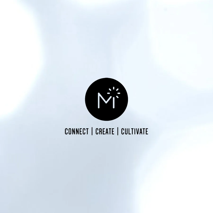
Working to create a brand identity for Mint Marketing in Albuquerque, New Mexico, I designed a modular identity system. Meaning that each part, the icon, type treatment, and tagline may be arranged in different combinations to distinguish the brand.

As time passes, brands may use less and less to visually communicate to their audience as it grows and learns. This strategy helps keep cost lower for the client while allowing me as the designer to produce, and think about the entire business life cycle. Plus, it allows the brand to continue visual consistency throughout, when applying the logos.

Here are six ways these branding elements are arranged to create a new visual identity for Mint Marketing.

studiojeffrey_mint_3
studiojeffrey_mint_4
studiojeffrey_mint_1
studiojeffrey_mint_2
studiojeffrey_mint_5
studiojeffrey_mint_6
tags: brand, branding, design, logo, identity, icon
categories: Branding, Design
Monday 12.18.17
Posted by jeff walters
 

YogaZo Branding →

Here are the results of the branding process with YogaZo, a growing brand that offers pop-up, yoga classes and an inclusive community.

The icon is designed combining the letters, Y and Z to represent a person moving through yoga poses. 

It appears in a circle because it's appealing to the eye, and it draws attention to the high contrast trademark. The circle represents the wholeness that yoga and community bring, the foundation of a YogaZo experience.

studiojeffrey_yogazo_1
studiojeffrey_yogazo_2

For each location there is a trademark. We wanted a mark for apparel design and promotional purposes. 

studiojeffrey_yogazo_3
studiojeffrey_yogazo_4
studiojeffrey_yogazo_5
studiojeffrey_yogazo_6

The next steps in the branding process will involve color, pattern and defining a style guide. 

tags: branding, design, graphicdesign, identity, logo, trademark, icon
categories: Design
Wednesday 03.15.17
Posted by jeff walters