• Portfolio
  • Latest
  • About
  • Contact
studiojeffrey
  • Portfolio
  • Latest
  • About
  • Contact

Mint Marketing - Visual Identity System

Working to create a brand identity for Mint Marketing in Albuquerque, New Mexico, I designed a modular identity system. Meaning that each part, the icon, type treatment, and tagline may be arranged in different combinations to distinguish the brand.

As time passes, brands may use less and less to visually communicate to their audience as it grows and learns. This strategy helps keep cost lower for the client while allowing me as the designer to produce, and think about the entire business life cycle. Plus, it allows the brand to continue visual consistency throughout, when applying the logos.

Here are six ways these branding elements are arranged to create a new visual identity for Mint Marketing.

studiojeffrey_mint_3
studiojeffrey_mint_4
studiojeffrey_mint_1
studiojeffrey_mint_2
studiojeffrey_mint_5
studiojeffrey_mint_6
tags: brand, branding, design, logo, identity, icon
categories: Branding, Design
Monday 12.18.17
Posted by jeff walters
 

Mint Marketing - Identity Designs

I was recently hired to design an identity for a new marketing firm in Albuquerque, New Mexico called Mint Marketing.

Immediately, we spoke about the naming and its use in the market place. We also spoke about the competition or other people using Mint in their name. This led to research that showed most designs included a mint leaf with their mint name. So, this became my starting point, to design without using a mint leaf.


studiojeffrey_mintmarketing_1
studiojeffrey_mintmarketing_2
studiojeffrey_mintmarketing_3
studiojeffrey_mintmarketing_4

The challenge became to visually communicate the strength and trustworthy nature of this agile new company in a clean and simple way. As part of Mint's marketing strategy they want a strong letter "M" in the identity and an icon that can be used on it's own. Plus, the tag line "connect, create, cultivate" to explain the mission of the company.


studiojeffrey_mintmarketing_5
studiojeffrey_mintmarketing_6
studiojeffrey_mintmarketing_7
studiojeffrey_mintmarketing_8

I used symbols of connection, light, bar charts, and line graphs to inspire the first round of designs. I always present these initial designs in black and white, as they need to work this way in branding at the most minimal visual points.


studiojeffrey_mintmarketing_9
studiojeffrey_mintmarketing_10
studiojeffrey_mintmarketing_11
studiojeffrey_mintmarketing_12

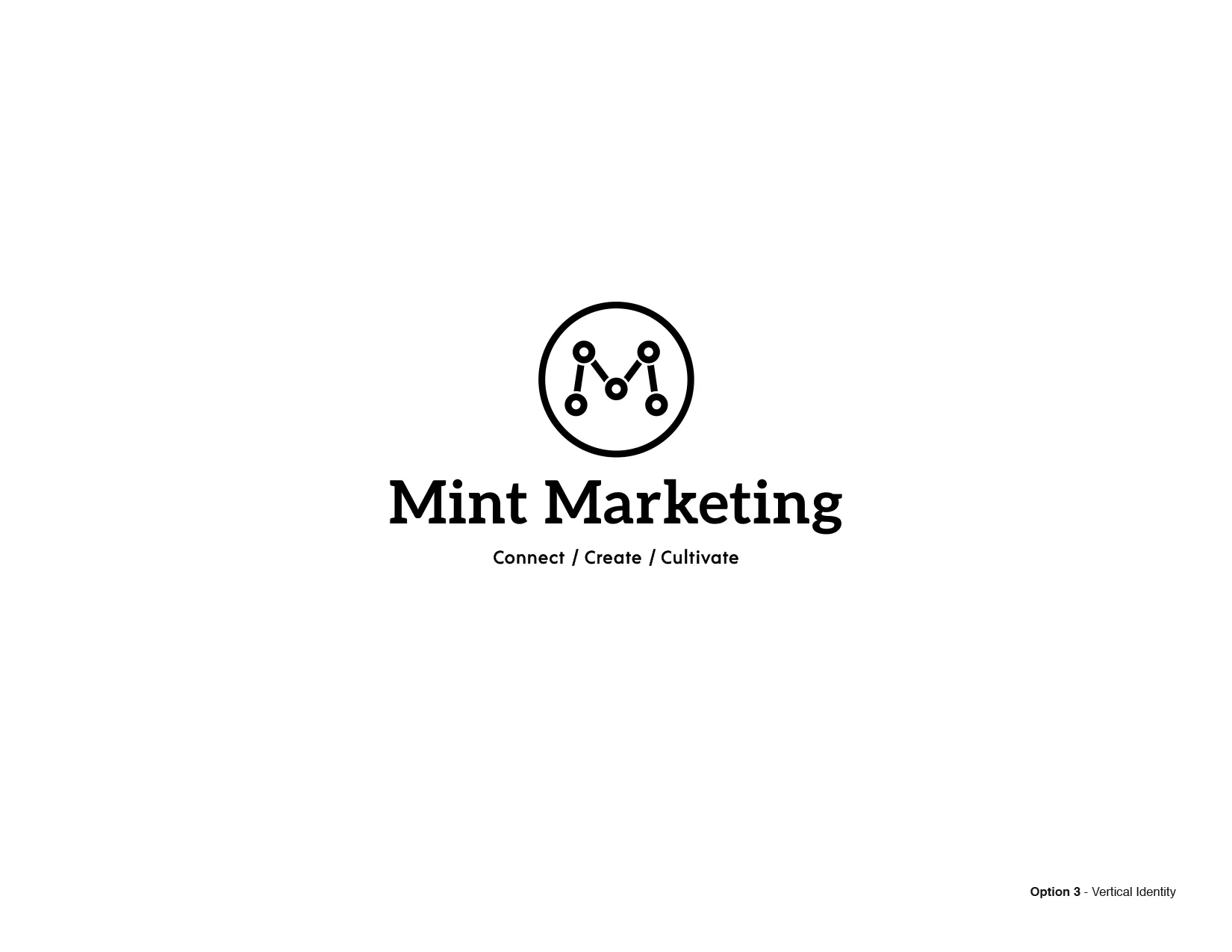
You're looking at the first round of identities that I presented this week. It includes four options, designed to be modular. Each option is a system that the client can add and subtract elements as needed. 


studiojeffrey_mintmarketing_13
studiojeffrey_mintmarketing_14
studiojeffrey_mintmarketing_15
studiojeffrey_mintmarketing_16
tags: design, branding, identity
categories: Design, Branding
Tuesday 12.05.17
Posted by jeff walters
Comments: 1
 

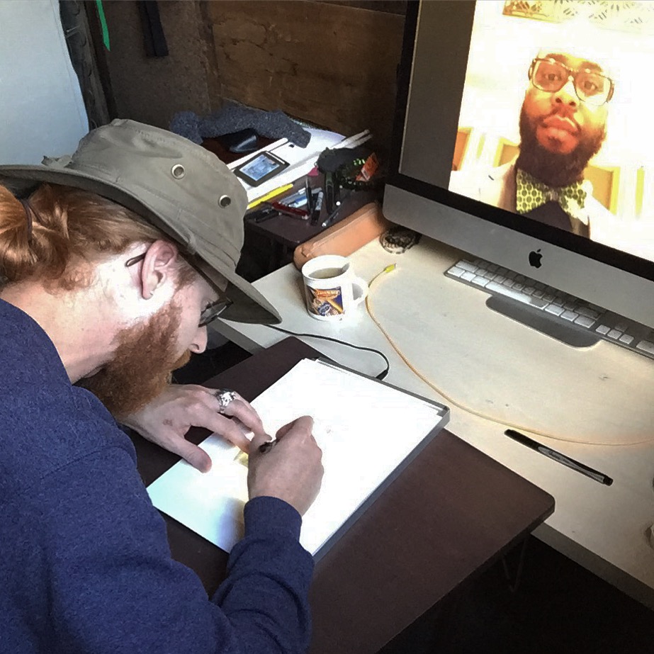
Son of Scorpio - Shoot and Sensibility

Giving it all I've got, making a reality of this brand. This weekend was very productive as I shot, and styled the first photoshoot with Matt Merino for Son of Scorpio. Grateful to have talented, and supportive people around. Thanks again, Matt & Derek! 

I am working to launch an online shop, and need to show off the products in a lookbook sort of way. To me, this brand is just as much about the connection in visuals, as the people wearing it on the street.

Here are a couple of shots and outtakes. Shop soon at sonofscorpio.com. Follow on instagram at @sonofscorpio_co

studiojeffrey_sonofscorpio_1
studiojeffrey_sonofscorpio_2
studiojeffrey_sonofscorpio_3
studiojeffrey_sonofscorpio_4
studiojeffrey_sonofscorpio_5
tags: branding, design, art, photography, website, brand
categories: Design, Branding, art
Sunday 11.19.17
Posted by jeff walters
 

Son of Scorpio - Sportsman Snapback

Had a great time designing this 3 color, woven patch for my Son of Scorpio brand. Here's a look at the sportsman snapback. My favorite light weight, mesh back, black hat. 

studiojeffrey_sonofscorpio_sportsman
tags: brand, design, art, photography, apparel
categories: Design, Branding, art
Saturday 11.11.17
Posted by jeff walters
 

Son of Scorpio - First Look

I've been working overtime making a new brand called, Son of Scorpio. Here's a look at some of the first designs. There will be an online shop at sonofscorpio.com soon.

I can't wait to continue designing and leading this brand. I see it as a creative vehicle, an outlet for my fashion and design passions. I'm designing sensible supplies, for people with style. It's from my heart. Follow on instagram @sonofscorpio_co

studiojeffrey_sonofscorpio_2
studiojeffrey_sonofscorpio_1
studiojeffrey_sonofscorpio_3
tags: brand, design, art, apparel
categories: Branding, art, Design
Thursday 11.09.17
Posted by jeff walters
 

Pattern Designs

Recently, I've been working on seamless pattern designs and layouts for Son of Scorpio. 
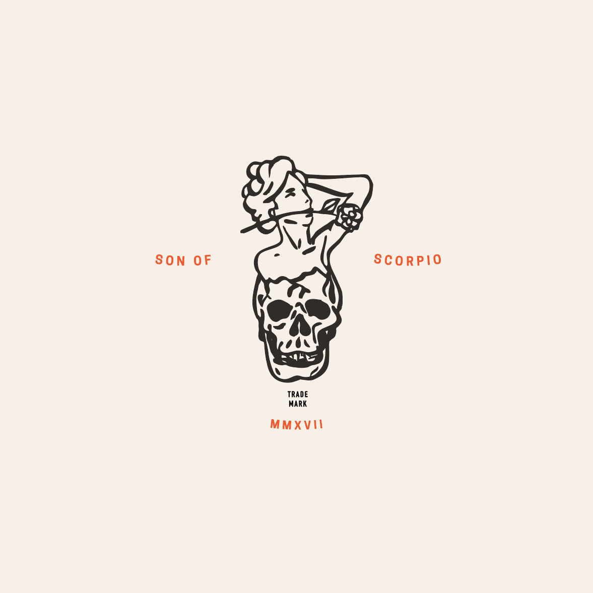
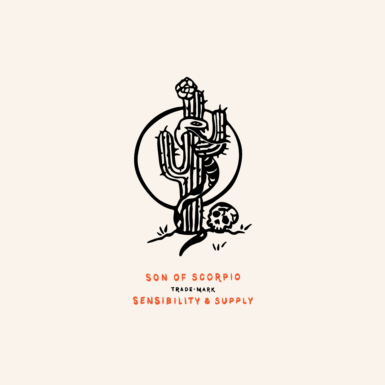
studiojeffrey_sonofscorpio_1
studiojeffrey_sonofscorpio_2
studiojeffrey_sonofscorpio_3
tags: pattern, apparel, design, illustration, art
categories: art, Branding, Design, Illustration
Friday 08.04.17
Posted by jeff walters
 

Son of Scorpio™

This is daunting and exciting. I've decided to launch my own trademark called Son of Scorpio. This artist owned brand will be one to supply dry goods and sensibilities to those who resonate with them. Here are some graphics I've been working on. 

studiojeffrey_sonofscorpio_1
studiojeffrey_sonofscorpio_2
studiojeffrey_sonofscorpio_3
tags: drawing, illustration, apparel, art
categories: art, Branding, Design, Drawing
Tuesday 07.18.17
Posted by jeff walters
 

Within Without

A new illustration, inspired by "Within You Without You".

studiojeffrey_withinwithout
tags: drawing, art, illustration
categories: Design, art
Friday 06.23.17
Posted by jeff walters
 

How Logos Became the Most Important Quarter-Inch in Business

"People are literally, physically interacting with those symbols in a way that they never did.”
-Michael Bierut

“Good appearance was a salable commodity.” 
-Raymond Loewy

“It’s not the mark, It’s the marketing.”
-Debbie Millman

"Applying interaction-design thinking to identity design results in logos that can be 'highly logical, very stripped down'."
-David Turner

"And in what may be the most surprising development in modern identity design, we’re increasingly learning how to do it ourselves—using the tenets of branding that have been established in professional circles, to create symbols for movements." 
-Debbie Millman

FULL ARTICLE

Illustration by 123 Klan for Fortune

Illustration by 123 Klan for Fortune

Source: http://fortune.com/2017/06/16/business-log...
tags: logo, branding, design, identity, graphic design
categories: Branding, Design
Friday 06.16.17
Posted by jeff walters
 

Art Directors Club of Denver: The Review

I believe in giving back. So, when I was invited to be a reviewer of student portfolios, I took the opportunity. It's a great way to see what students are working on and meet other designers in town.

The Review is an annual event put on by Art Directors Club of Denver and AIGA Colorado. It was fun to see the work and pass on what I've been taught throughout the years. 

adcd_studiojeffrey_review
tags: design, graphicdesign
categories: Design
Saturday 04.29.17
Posted by jeff walters
 

The Pixel Painter-Documentary

Inspiring, short documentary about a retired, graphic artist. He has macular degeneration, and now paints using a computer with pixels large enough to see. 
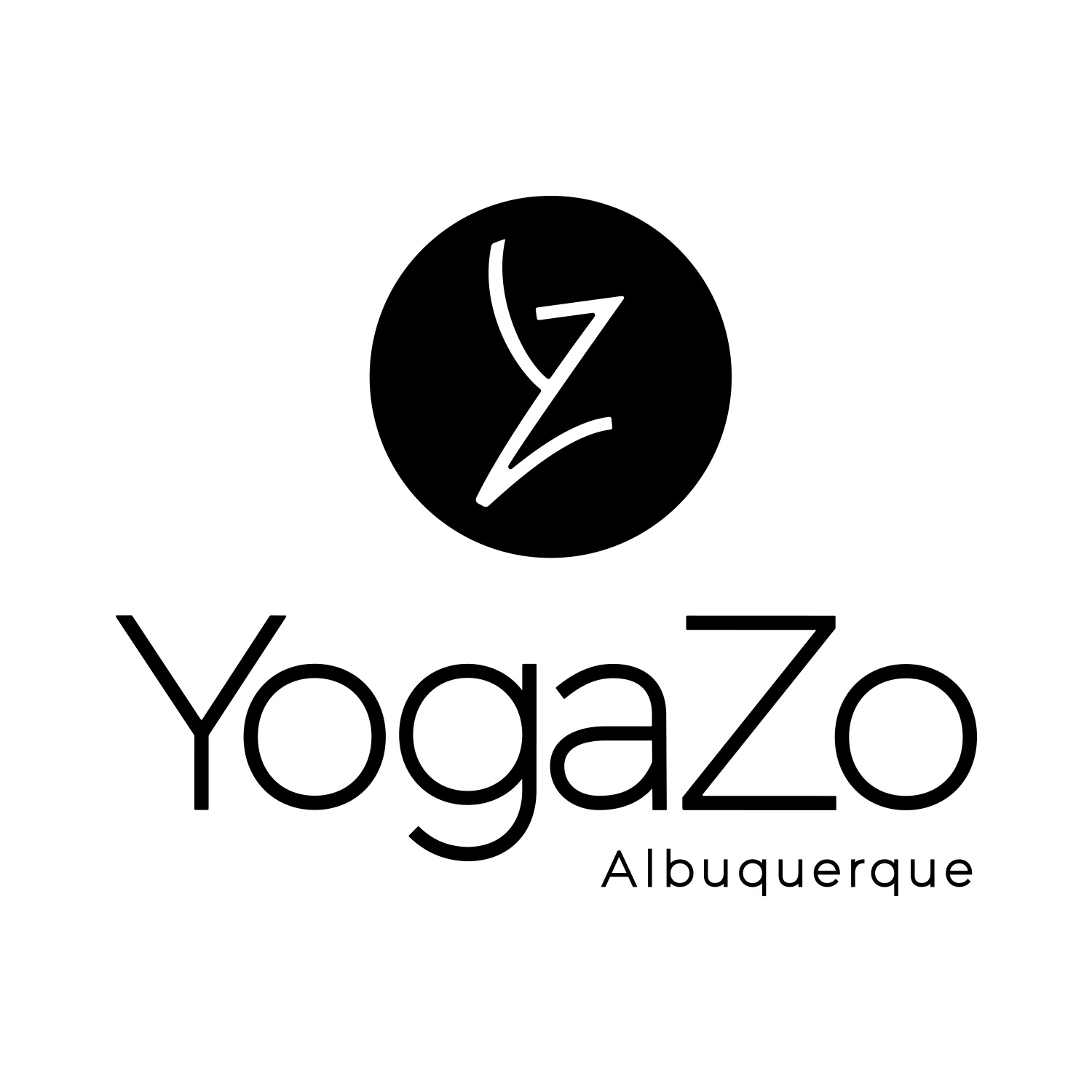
tags: design, graphicdesign, documentary
categories: Design, Documentary
Wednesday 03.22.17
Posted by jeff walters
 

YogaZo Branding →

Here are the results of the branding process with YogaZo, a growing brand that offers pop-up, yoga classes and an inclusive community.

The icon is designed combining the letters, Y and Z to represent a person moving through yoga poses. 

It appears in a circle because it's appealing to the eye, and it draws attention to the high contrast trademark. The circle represents the wholeness that yoga and community bring, the foundation of a YogaZo experience.

studiojeffrey_yogazo_1
studiojeffrey_yogazo_2

For each location there is a trademark. We wanted a mark for apparel design and promotional purposes. 

studiojeffrey_yogazo_3
studiojeffrey_yogazo_4
studiojeffrey_yogazo_5
studiojeffrey_yogazo_6

The next steps in the branding process will involve color, pattern and defining a style guide. 

tags: branding, design, graphicdesign, identity, logo, trademark, icon
categories: Design
Wednesday 03.15.17
Posted by jeff walters
 

Where There's Smoke There's Fire

A new drawing

studiojeffrey_skullyang
categories: Illustration, Design
Friday 12.02.16
Posted by jeff walters
 

Design for Obama Re-Launched →

Creative Action Network has re-lanched the Design for Obama campaign to say #thanksobama. My published, Barack 'n' Roll poster is now available, for the second and final time.

designforobama_studiojeffrey
designforobama_2_studiojeffrey
Buy Poster

And here's the Taschen book it was published in, Design for Obama - Posters for Change: A Grassroots Anthology.  

Design for Obama by Steven Heller (author), Aaron Perry-Zucker (editor), Spike Lee (editor)

Design for Obama by Steven Heller (author), Aaron Perry-Zucker (editor), Spike Lee (editor)

Buy Book
categories: Design, Illustration
Thursday 12.01.16
Posted by jeff walters
 

T-shirt Graphic →

This is a test of some new shirts I'm trying out with some of the Son of Scorpio graphics. With a new brand on my mind, this is how it starts.

fallen_sonofscorpio_studiojeffrey
tags: illustration, graphic, apparel
categories: Design, Process
Monday 09.05.16
Posted by jeff walters
 

Son of Scorpio →

I've been working to define an illustration style based on a process. I have settled, for now, after a lot of experimenting. I've tried just pencil and paper, paint, ink and collage to define a style. I found a combination of paper and ink plus the computer is a fun place to work because it's limitless. I can start out with a blank page and draw the image. Then, take it to the computer and manipulate it further as vector shapes. I like the vintage look of something having aged and been printed a long time ago when inks bled to make curved edges, nothing is exact. I am inspired and learned a lot from the work of Simon Walker, LAND and Mike Giant. Son of Scorpio is the name of my new set of drawings.

sonofscorpio_studiojeffrey_shirt
sonofscorpio_studiojeffrey_bike
sonofscorpio_studiojeffrey_boot
sonofscorpio_studiojeffrey_gypsy
sonofscorpio_studiojeffrey_hat
sonofscorpio_studiojeffrey_vest
sonofscorpio_studiojeffrey_lifedeath
tags: drawing, design, illustration
categories: Design
Friday 08.12.16
Posted by jeff walters
 

Vote Our Planet →

For the past few years I've been asked to contribute to Creative Action Network's campaigns. They are a talented group of people who show and sell my work across the country. The latest campaign I made a design for is called "Vote our Planet". I took the opportunity to practice telling a story in one image. I had fun making these cartoon like illustrations. Here's my contribution.

voteourplanet_studiojeffrey
tags: graphic, illustration, drawing
categories: Design
Monday 08.08.16
Posted by jeff walters
Comments: 1
 

Orlando is Love →

The other morning I woke to find a direct message on my Instagram account from a designer I really respect in New York City. It was Rafael from Alfalfa Studio. He asked me to contribute a design to his activism effort #orlandoislove. I chose to illustrate a portrait of Darryl "DJ" Roman Burt II, who lost his life June 12, 2016. It's sickening to think about the night that unfolded in Orlando. Spread love, not fear and hate. Here's my small contribution.

orlandoislove
drawing_process
tags: drawing, illustration, art
categories: Design
Saturday 08.06.16
Posted by jeff walters
 
Newer / Older