YogaZo Branding →
Here are the results of the branding process with YogaZo, a growing brand that offers pop-up, yoga classes and an inclusive community.
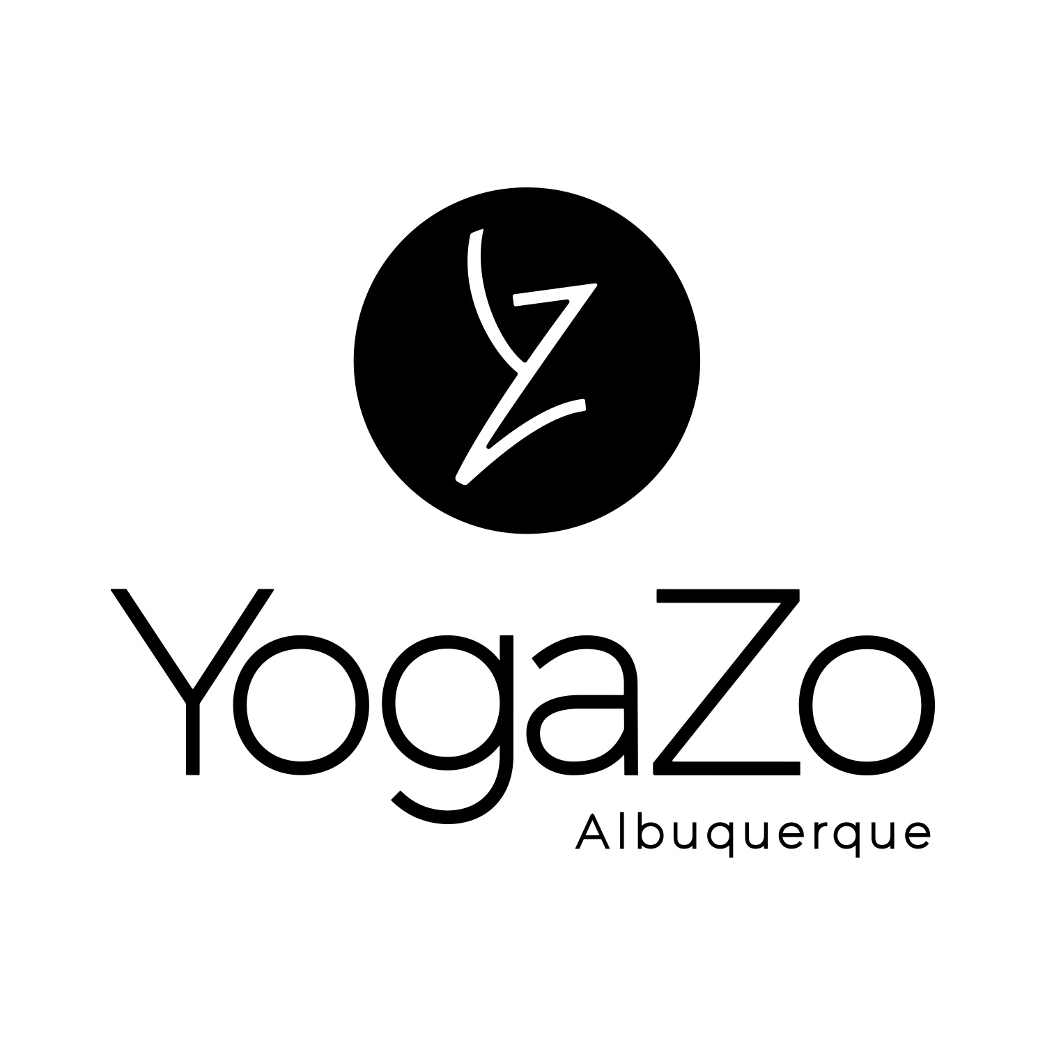
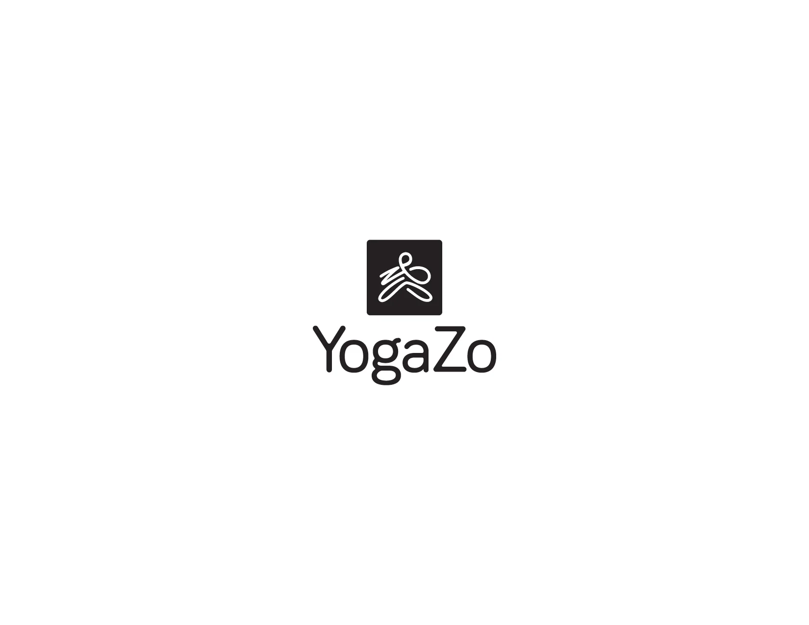
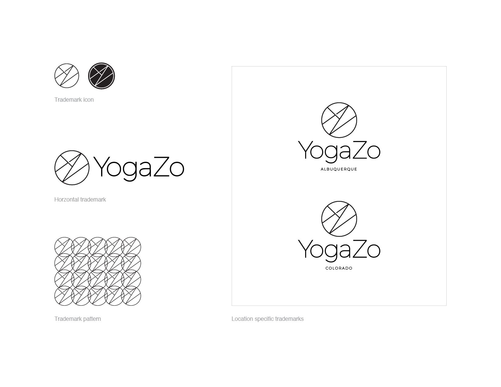
The icon is designed combining the letters, Y and Z to represent a person moving through yoga poses.
It appears in a circle because it's appealing to the eye, and it draws attention to the high contrast trademark. The circle represents the wholeness that yoga and community bring, the foundation of a YogaZo experience.


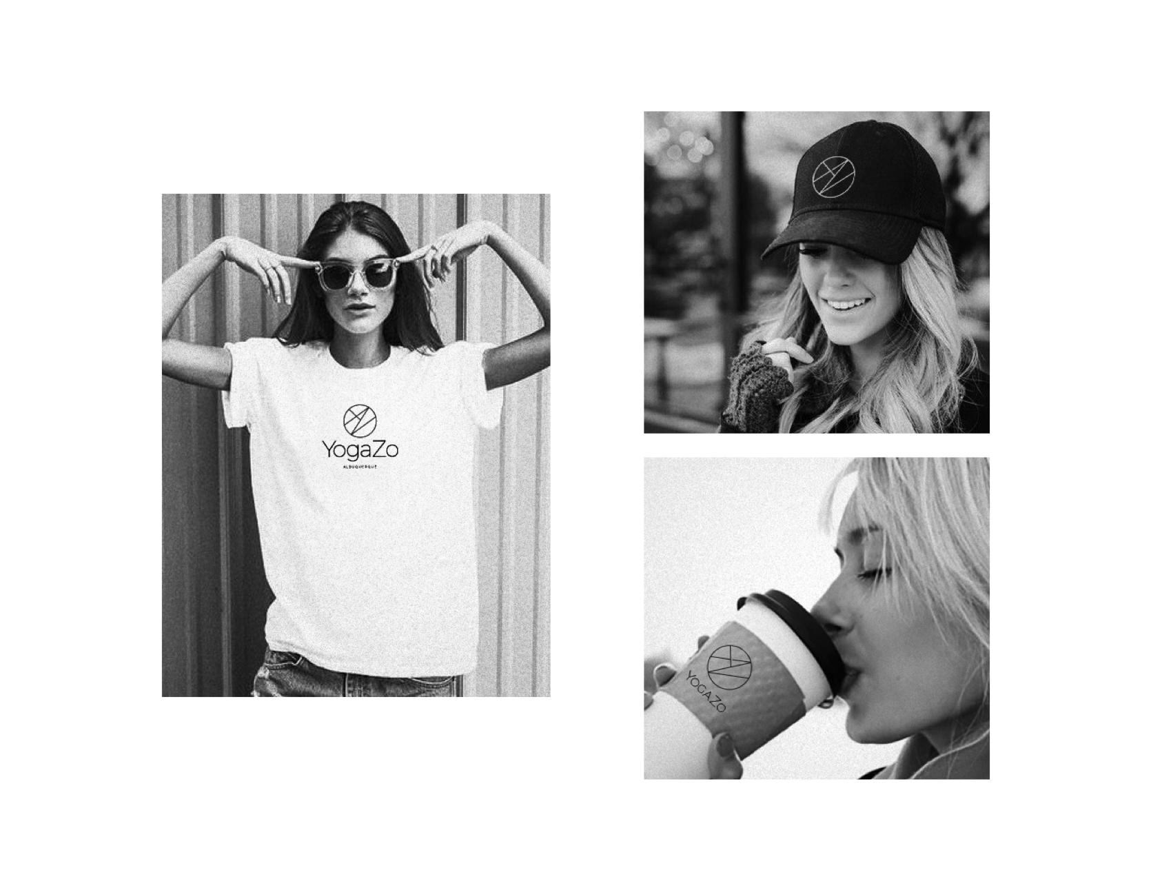
For each location there is a trademark. We wanted a mark for apparel design and promotional purposes.


The next steps in the branding process will involve color, pattern and defining a style guide.
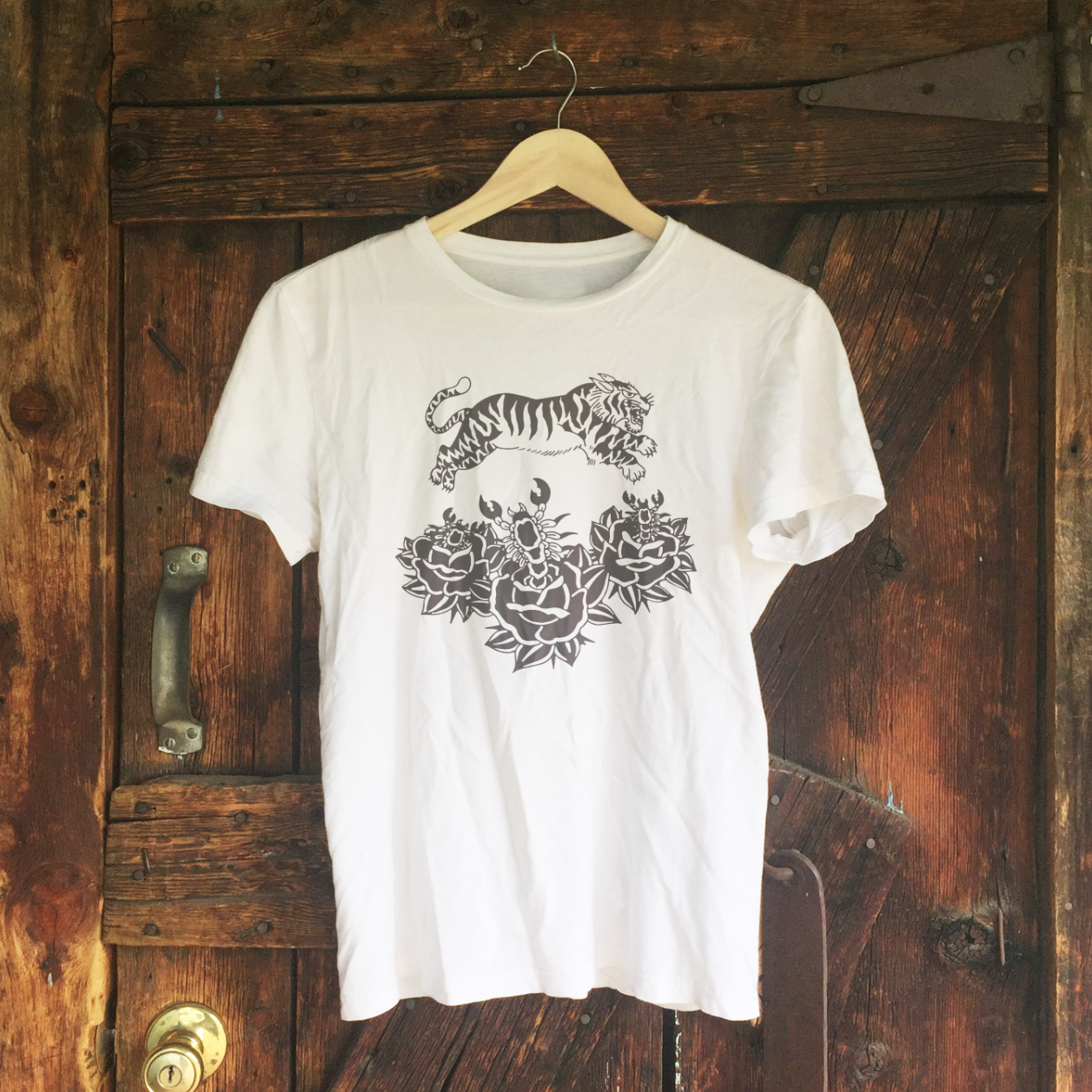
Studio Jeffrey Branding
I took the opportunity over the past few weeks to brand my studio and further define it's offerings.

I began sketching the word STUDIO, because that's first and foremost what I want to identify and communicate. It's a studio, open to possibility and inspiration. It's where I apply graphic design, illustration, art techniques, brand consulting and creative direction to produce visual communication for brands and my own studio.

I sketch in pencil first to feel out the letters and spacing. I placed JEFFREY, smaller, in between the larger letters and it fit perfectly. Something clicked for me in seeing the sketch. Something about how my goal in working with design is to piece together ideas, budgets, people, and concepts into visual communication that can be understood and connect a lot of people.
Looking at this design, I had to figure it out, and I liked that a lot. Much like the design process, it's a puzzle that I interpret to produce something original. I also thought that the overall shape was attractive with its symmetry. I took the idea to the computer and rendered a vector version of the design.

Above is the finalized, identity design.
Designing an icon to go along with the primary identity was important to me. Not only because I love icons, but because I believe simple symbols are most effective in promotion, and leaving a lasting impression of a brand. Icons also come into play when co-branding and collaborating.
I began sketching the overlapped letters, S and J, into something like a flower or mandala shape. This is because I want to grow. I want my work to grow, my relationships to grow and I want the brand to grow, naturally. The same goes for clients I work with.

The identities I design are systems that are created to last years and years, in order to have the consistency that is needed to produce a memorable brand.
Here are the finalized icon designs in black and white.
While working with this branding, I wanted an alternate version of the identity, combining the icon design and letters. This design will act as a stamp, to mark my products and work in certain promotional situations.
Here are the alternate, identity designs in black and white.


I love working and branding in black and white. In my experience, it seems to stand out when placed in the world. A lot of other designs use color, so the high contrast nature of black and white allows the message to come through loud and clear. Not to mention, it's cheaper to reproduce and appears clean on digital screens.
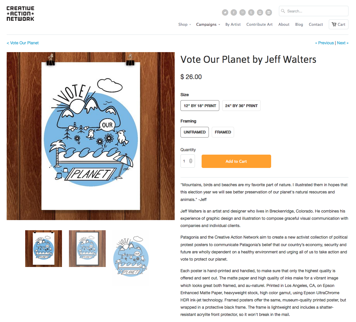
YogaZo Identity Design
I was recently hired as a brand consultant and designer for the up-and-coming brand, YogaZo. They are based in Albuquerque, New Mexico and have grown their offerings to Denver, Colorado. YogaZo is a brand that features yoga classes at pop-up locations, plus a growing community that is inclusive and supportive.
Here are the identity designs that I presented to YogaZo. The goal was to create a trademark that identifies the company not only as a yoga brand, but a lifestyle brand, as they set up shop in Albuquerque and continue to extend their offerings.
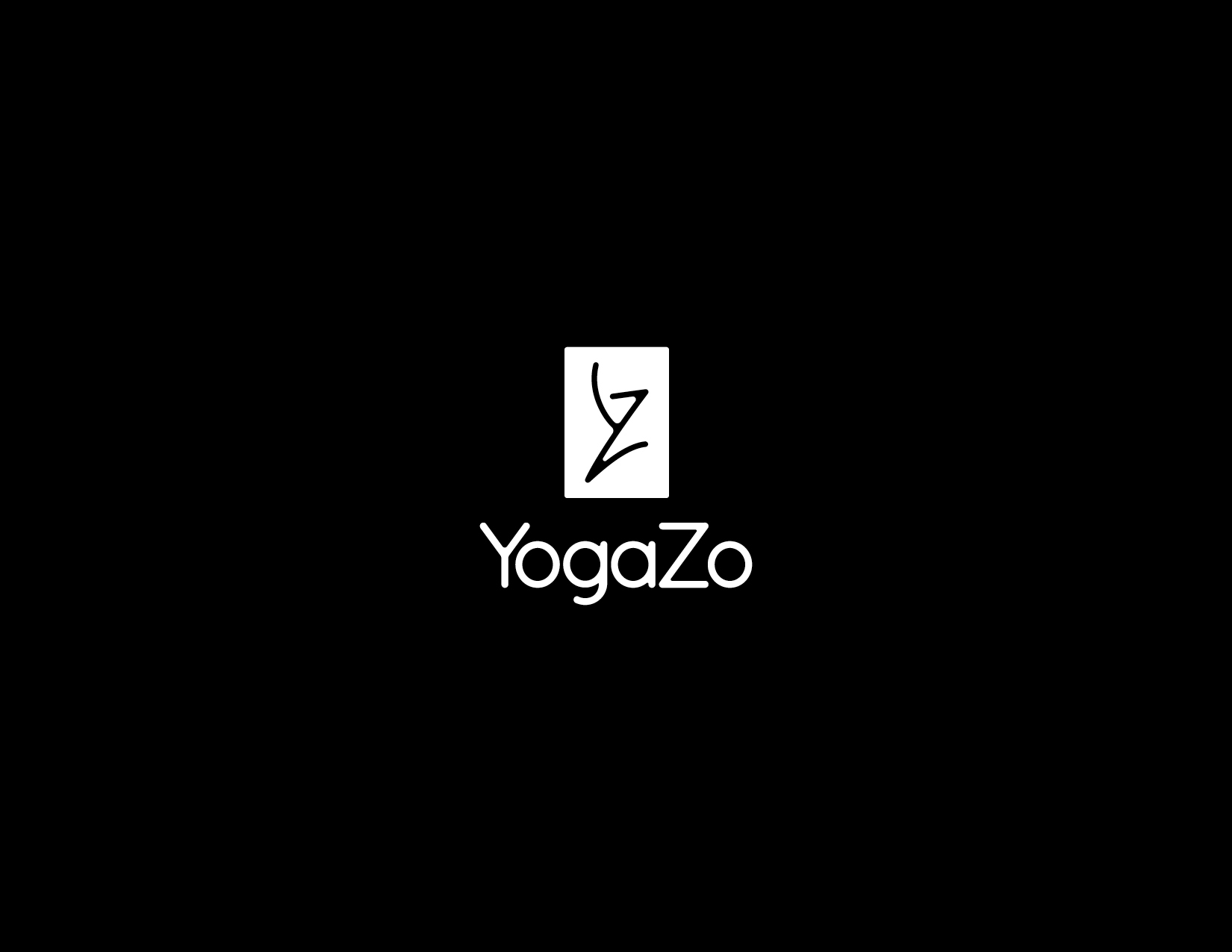
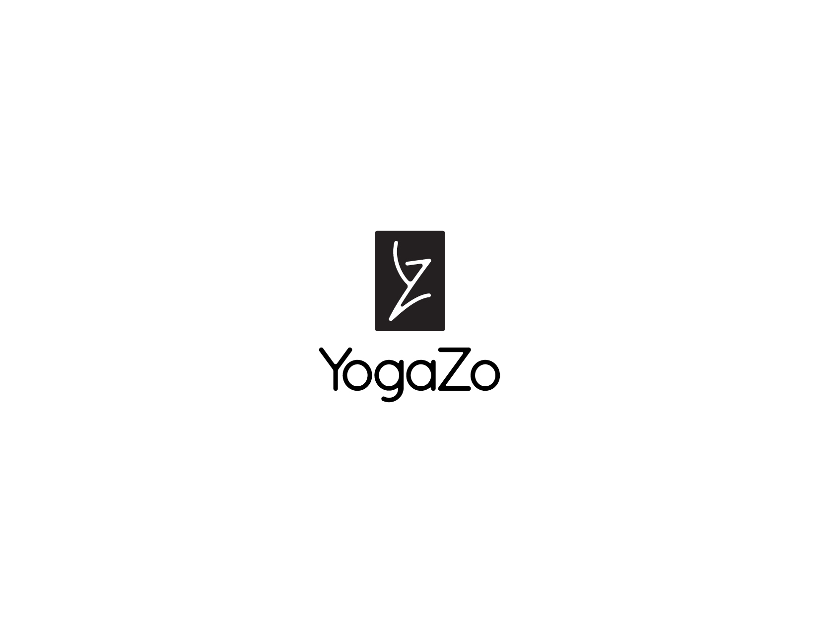
At first, in designing and presenting an identity package, I work in black and white only. Leaving color to be determined after a design direction is selected.
Design Direction 1


Design Direction 2


Design Direction 3


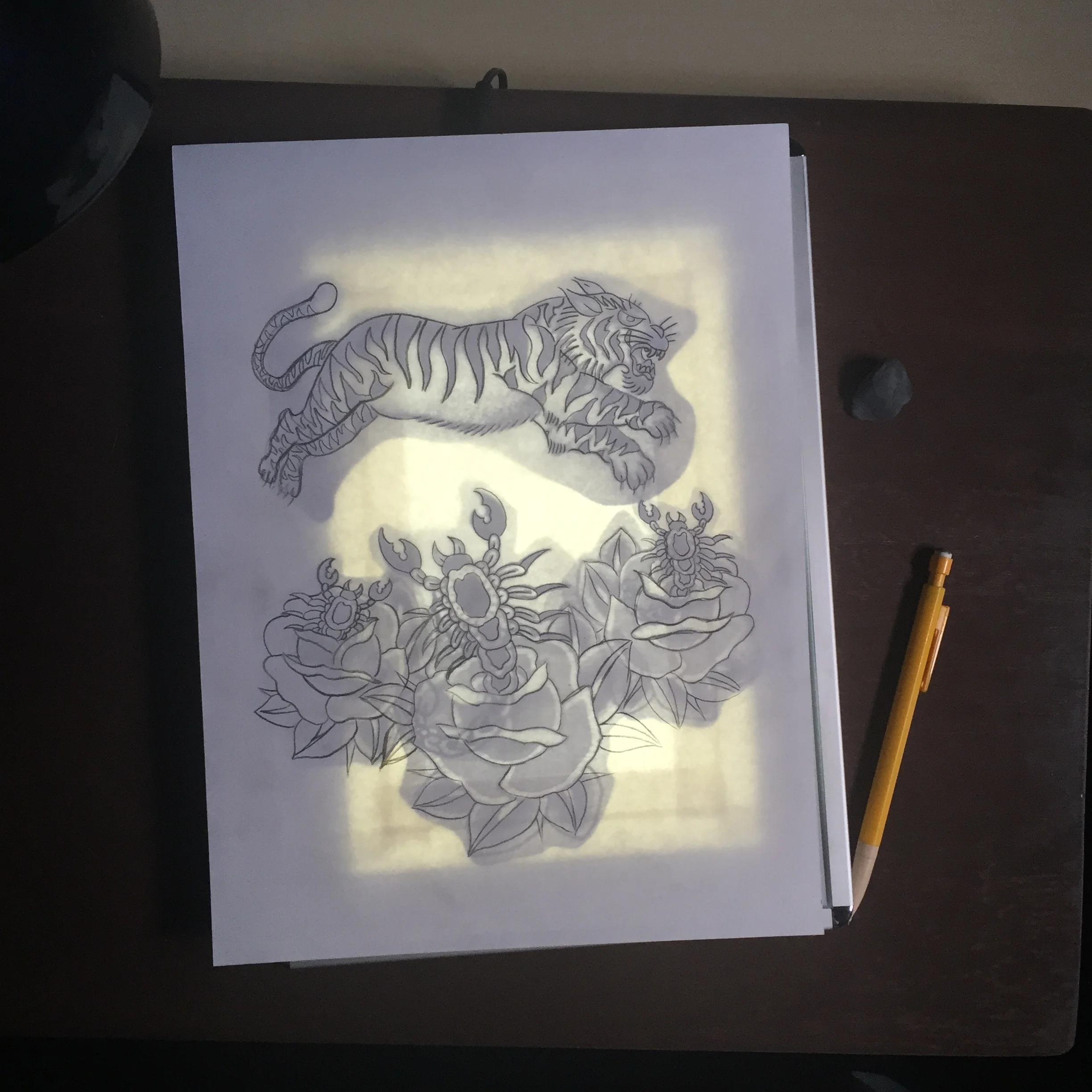
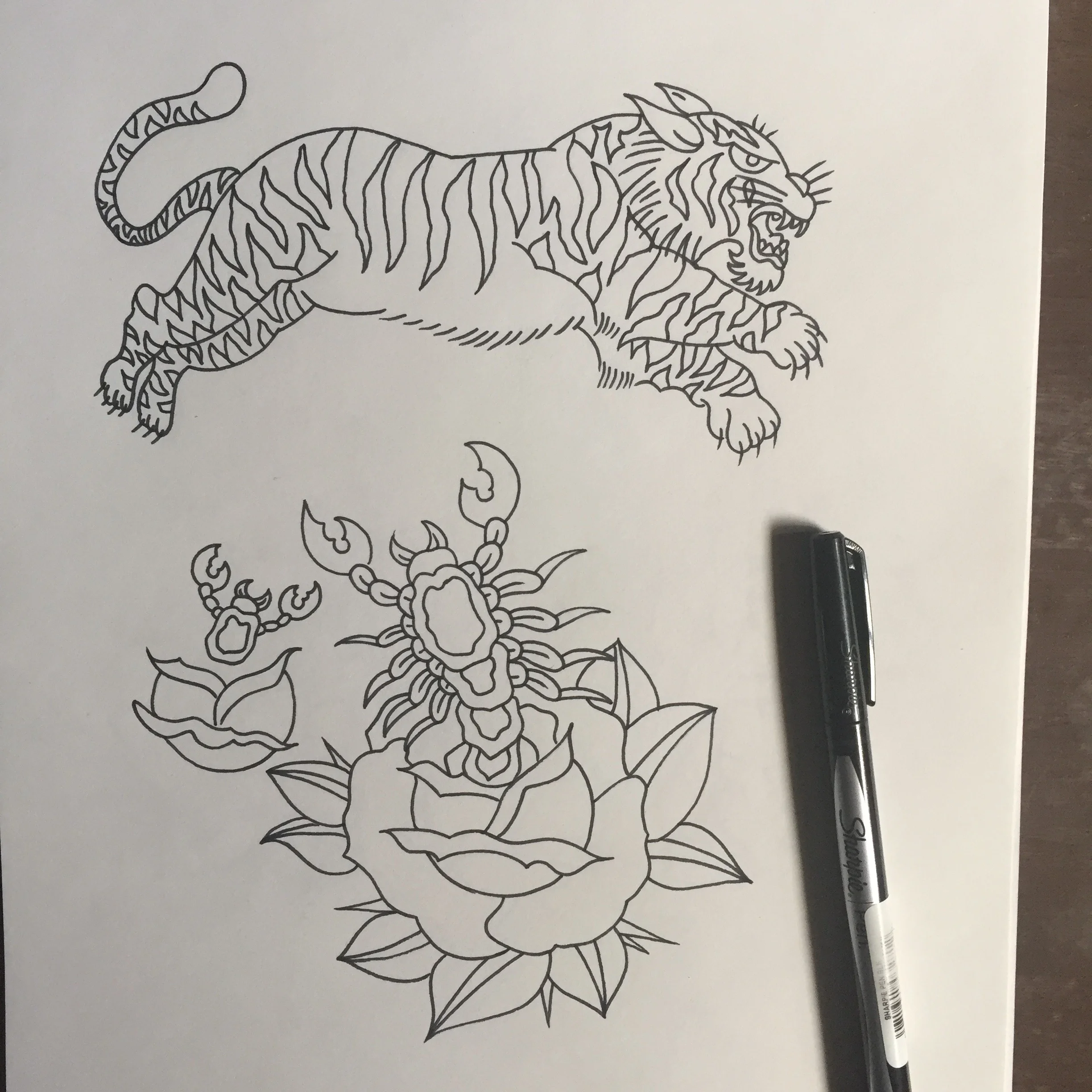
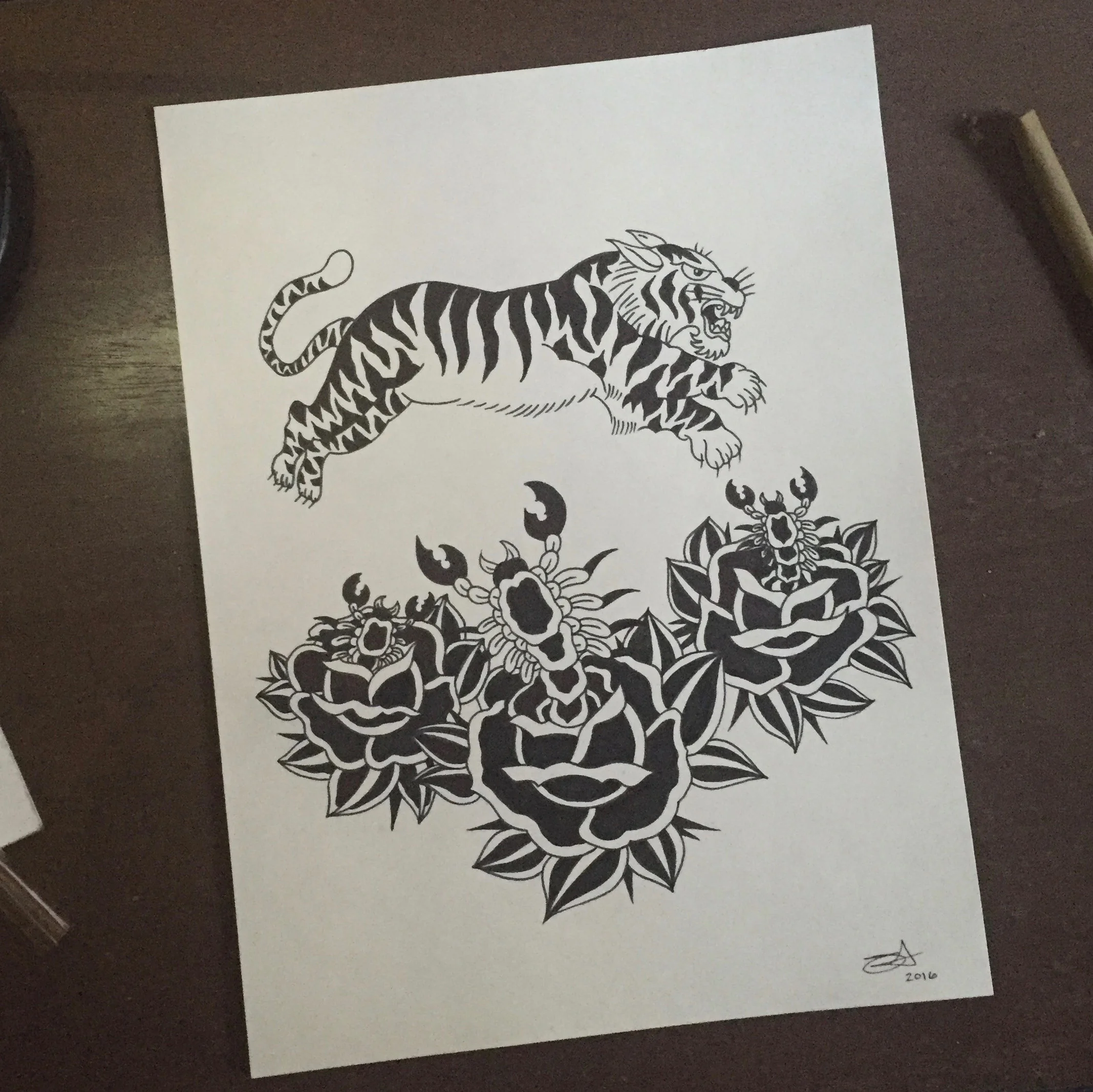
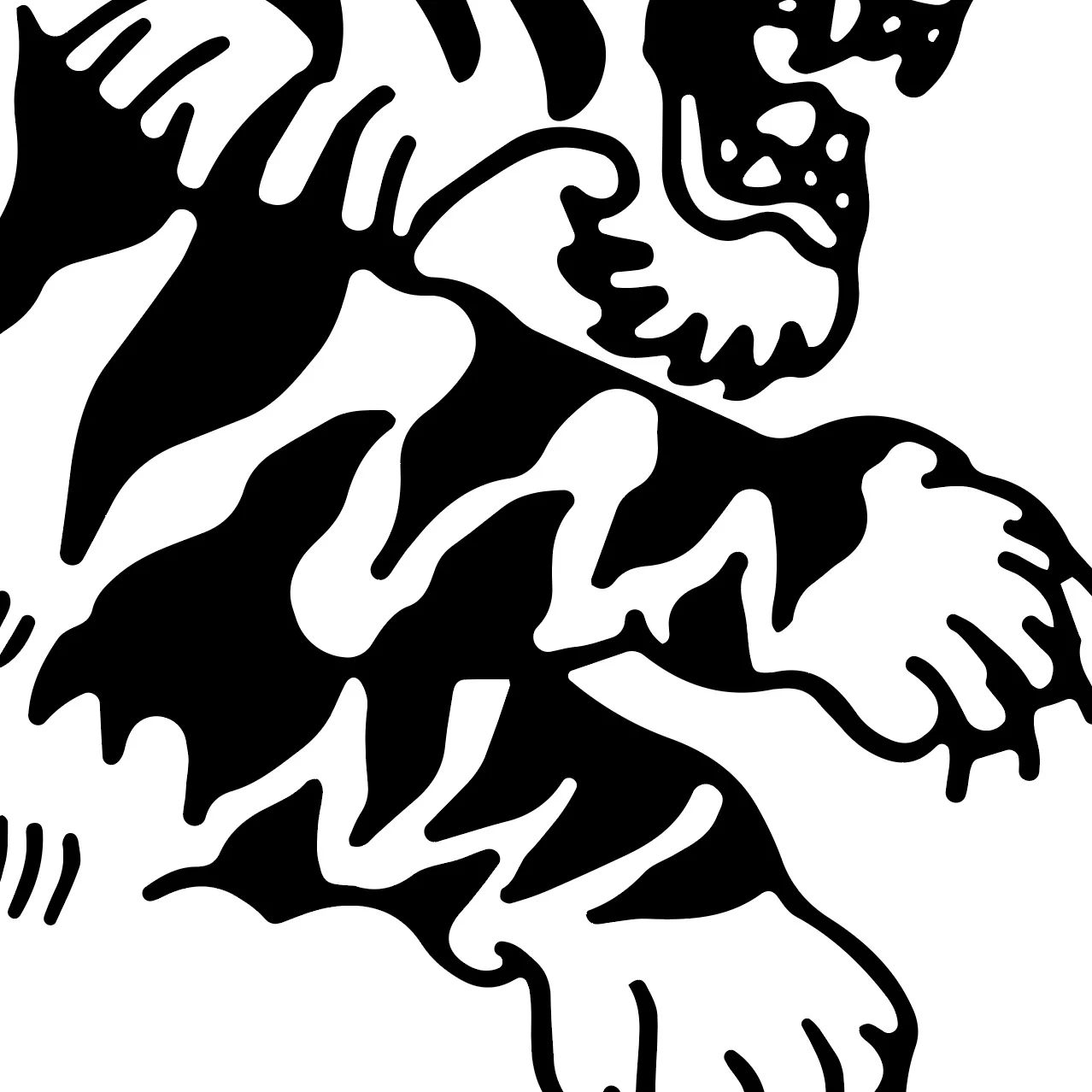
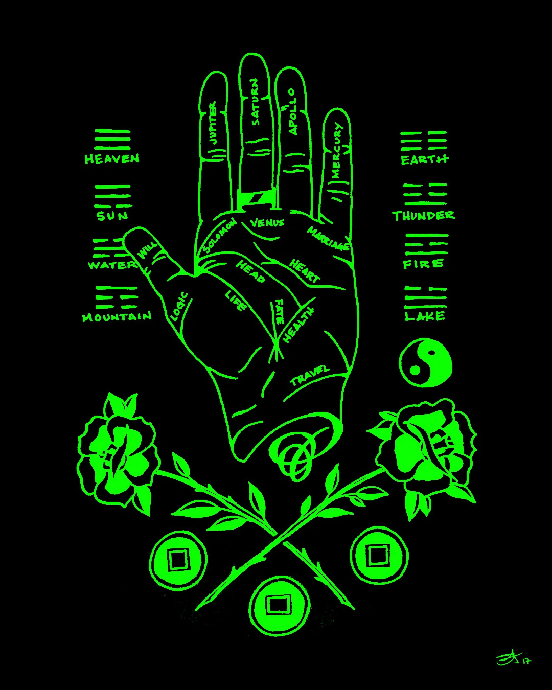
Palmistry
A new illustration


Ryan Adams illustration
In anticipation of Ryan's new album Prisoner, here's a new illustration featuring the artist.

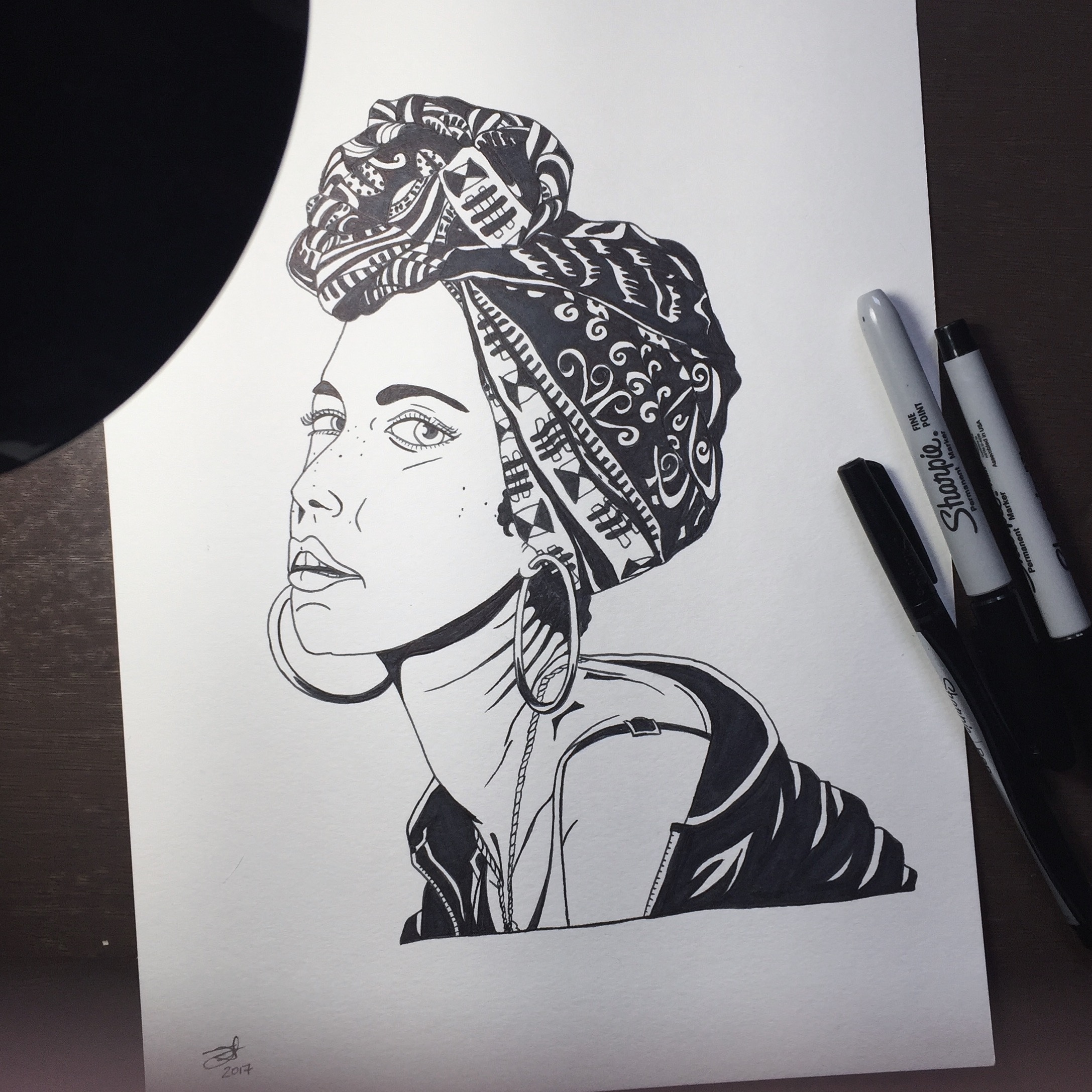
Alicia Keys portrait
Here's the full color version of Alicia illustrated.

Inking Alicia's portrait
Alicia Keys' work ethic and personality have always been inspiring to me. I've met her a few times and every time she is gracious, funny and cool. Here's to you Alicia and your new album.
?uestlove
A new watercolor painting to celebrate Ahmir Thompson's birthday.

Spades
A new drawing.

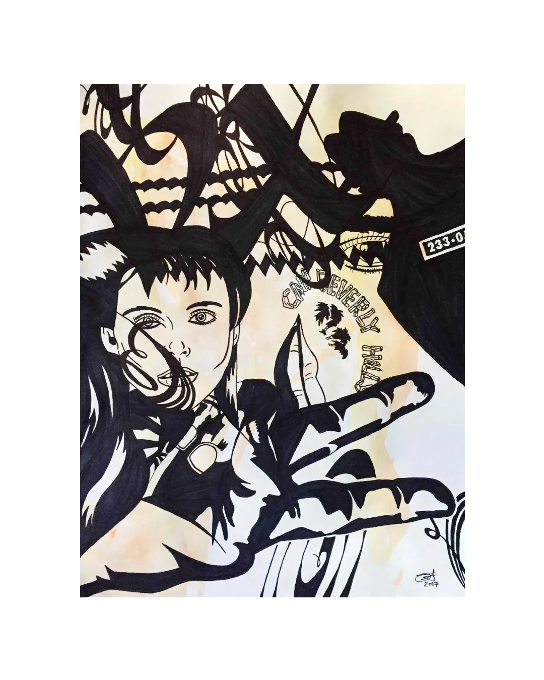
Beverly Hills Two
A new drawing
Beverly Hills
By deconstructing images in old magazines, I love to reconstruct new layouts like this.

Native Sun
A new illustration based on a water jug I have by my desk.

Where There's Smoke There's Fire
A new drawing

Design for Obama Re-Launched →
Creative Action Network has re-lanched the Design for Obama campaign to say #thanksobama. My published, Barack 'n' Roll poster is now available, for the second and final time.


And here's the Taschen book it was published in, Design for Obama - Posters for Change: A Grassroots Anthology.

Design for Obama by Steven Heller (author), Aaron Perry-Zucker (editor), Spike Lee (editor)
Artist Feature on Meural →
I just found out that "Wolf Love", a poster I designed for Creative Action Network, will be featured as part of their partnership with Meural. It's a new way to view your collection, a digital frame displaying art with a matte finish.


Photos ©Mural