Studio Jeffrey Branding

I took the opportunity over the past few weeks to brand my studio and further define it's offerings. 

StudioJeffrey_trademarks

I began sketching the word STUDIO, because that's first and foremost what I want to identify and communicate. It's a studio, open to possibility and inspiration. It's where I apply graphic design, illustration, art techniques, brand consulting and creative direction to produce visual communication for brands and my own studio.

I sketch in pencil first to feel out the letters and spacing. I placed JEFFREY, smaller, in between the larger letters and it fit perfectly. Something clicked for me in seeing the sketch. Something about how my goal in working with design is to piece together ideas, budgets, people, and concepts into visual communication that can be understood and connect a lot of people.

Looking at this design, I had to figure it out, and I liked that a lot. Much like the design process, it's a puzzle that I interpret to produce something original. I also thought that the overall shape was attractive with its symmetry. I took the idea to the computer and rendered a vector version of the design. 

studiojeffrey_identity
Studio_Jeffrey_identity

Above is the finalized, identity design.

StudioJeffrey_icon_process2

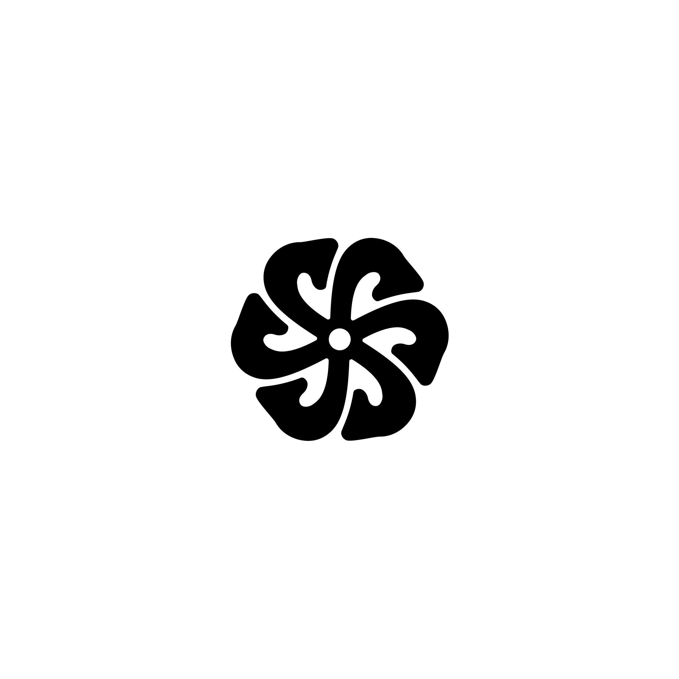
Designing an icon to go along with the primary identity was important to me. Not only because I love icons, but because I believe simple symbols are most effective in promotion, and leaving a lasting impression of a brand. Icons also come into play when co-branding and collaborating. 

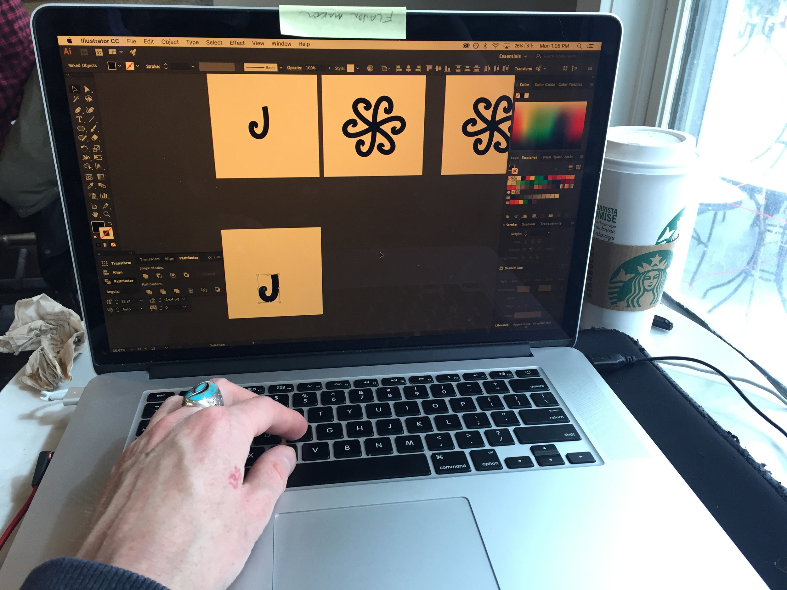
I began sketching the overlapped letters, S and J, into something like a flower or mandala shape. This is because I want to grow. I want my work to grow, my relationships to grow and I want the brand to grow, naturally. The same goes for clients I work with.

Studio_Jeffrey_iconprocess

The identities I design are systems that are created to last years and years, in order to have the consistency that is needed to produce a memorable brand.

Here are the finalized icon designs in black and white. 

Studio_Jeffrey_icon_black
StudioJeffrey_icon_black

While working with this branding, I wanted an alternate version of the identity, combining the icon design and letters. This design will act as a stamp, to mark my products and work in certain promotional situations.

Here are the alternate, identity designs in black and white.

StudioJeffrey_Alt_Identity
StudioJeffrey_Alt_Identity_2

I love working and branding in black and white. In my experience, it seems to stand out when placed in the world. A lot of other designs use color, so the high contrast nature of black and white allows the message to come through loud and clear. Not to mention, it's cheaper to reproduce and appears clean on digital screens.