studiojeffrey

View Original

Mint Marketing - Identity Designs

I was recently hired to design an identity for a new marketing firm in Albuquerque, New Mexico called Mint Marketing.

Immediately, we spoke about the naming and its use in the market place. We also spoke about the competition or other people using Mint in their name. This led to research that showed most designs included a mint leaf with their mint name. So, this became my starting point, to design without using a mint leaf.


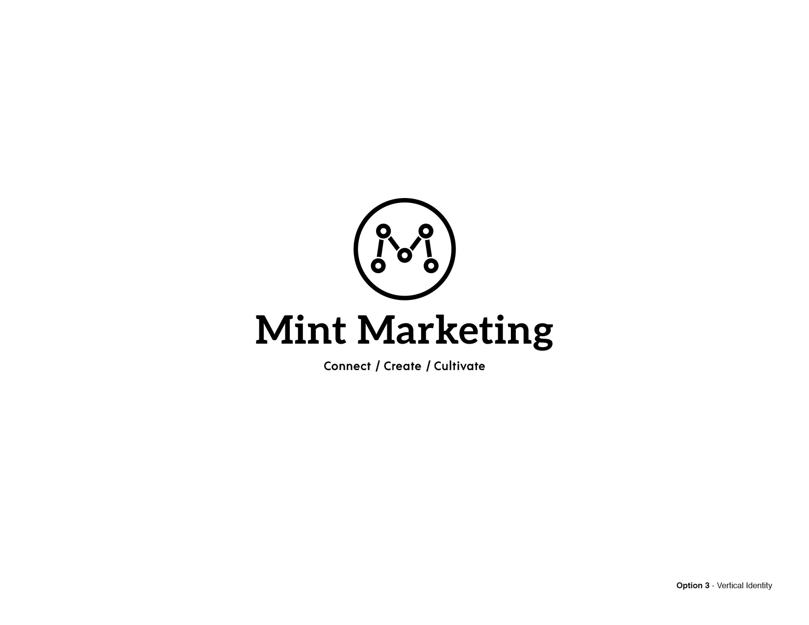
The challenge became to visually communicate the strength and trustworthy nature of this agile new company in a clean and simple way. As part of Mint's marketing strategy they want a strong letter "M" in the identity and an icon that can be used on it's own. Plus, the tag line "connect, create, cultivate" to explain the mission of the company.


I used symbols of connection, light, bar charts, and line graphs to inspire the first round of designs. I always present these initial designs in black and white, as they need to work this way in branding at the most minimal visual points.


You're looking at the first round of identities that I presented this week. It includes four options, designed to be modular. Each option is a system that the client can add and subtract elements as needed.