
Branding Design & Illustration
Denver, CO. studiojeffrey, llc. ©2025
branding design
Alpine Modern

LON Little Shop

Sprout
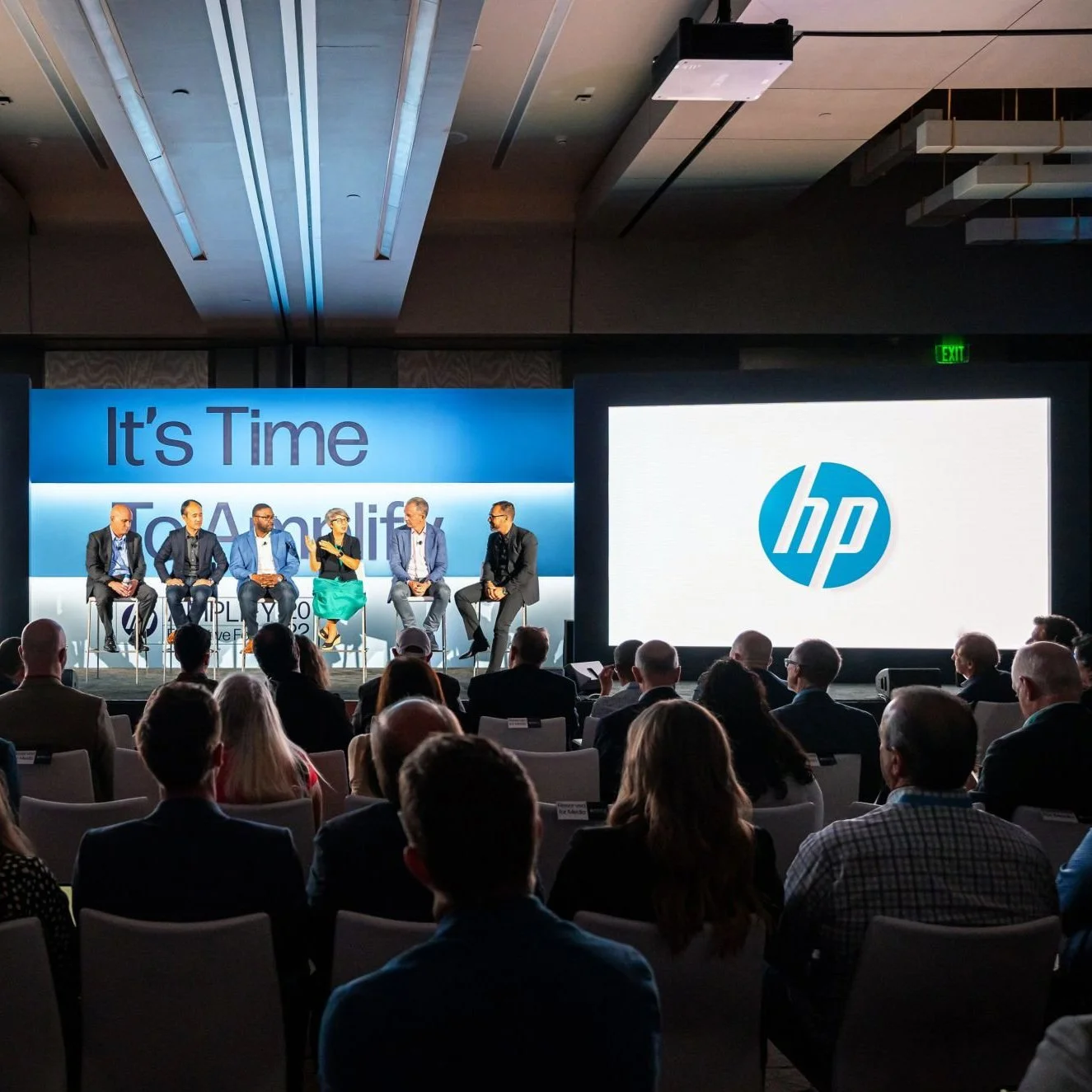
HP

Tenet Coffee

Son of Scorpio

Audible X Sundance Film Festival

Alpine Modern Quarterly
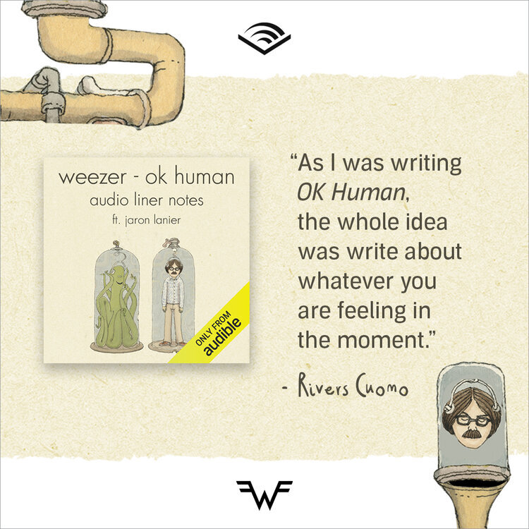
Audible x Weezer
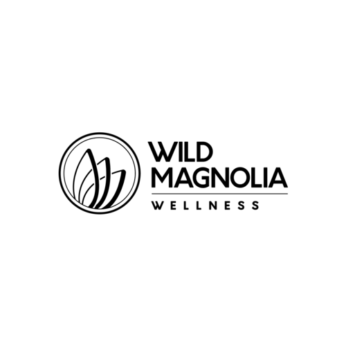
Wild Magnolia Wellness

Bold Design Co.

Tedx Boulder

Authentic Leadership Center at Naropa University

Zola Tradeshow Booth

E.O. Wilson’s Half-Earth Project
illustration

Wolf Love

Illustration
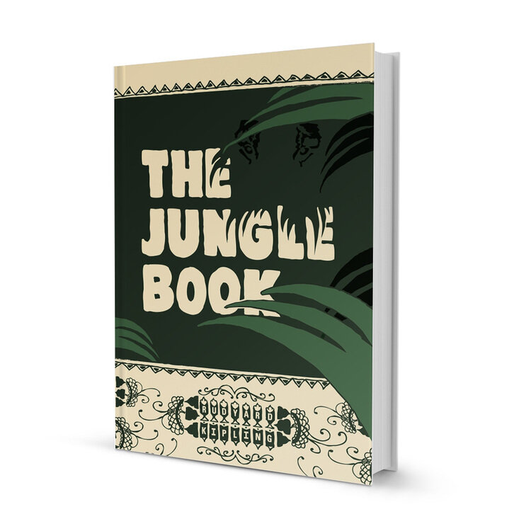
The Jungle Book
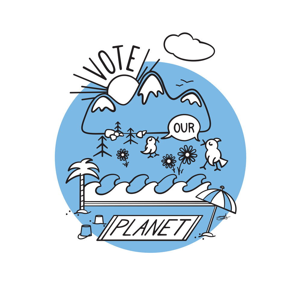
Vote Our Planet

Illustrated Lyrics

Pica’s

Bighorn Pretzel Co.